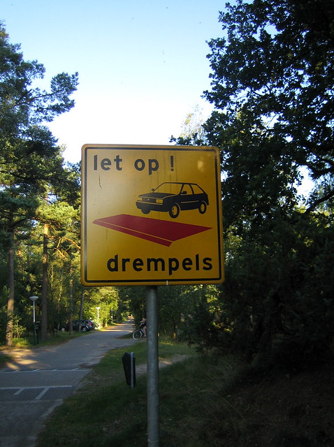
Linked here is a collection of silly and funny signs found on flickr.
Author: admin
Self Referential Escalator Sign
The photo of the sign posted on LiveJournal and on flickr at first appears to be a sign about the sign itself.
Actually, the purpose of the sign is to act as a blocker so that people who tries to lean over the escalator will get hit on the head by the sign rather than getting their heads caught in the narrowing gap between the column and escalator.
Dangerous Sign with Sharp Edges
Some signs are useless. In addition, this one is dangerous too and it says so…
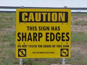
This sign says “CAUTION: This sign has sharp edges. Do not touch the edges of this sign.” Well, if the sign wasn’t there, then there wouldn’t be any sharp edges for us to touch. And there wouldn’t be a need for such a Caution.
Actually, I think the sign is about “no smoking”. See tiny icon in lower right. Not sure what is the icon on lower left indicate.
And the bottom text says “Also, the bridge is out ahead.” I guess, they thought the sharp edges of the sign is more important the a bridge being out.
This sign reminds me of another ironic sign linked here.
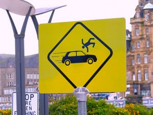
Sign of Person Flying Over Car
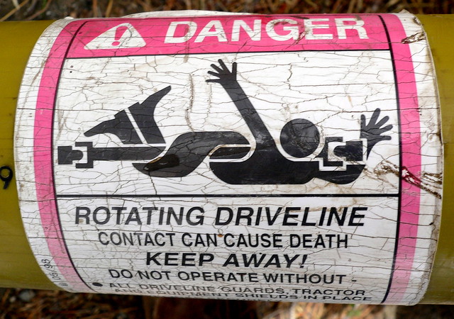
Sign of Person Wrapped Around an Axle
Sign of Hula Hoop Person
Not sure what is the meaning of this sign…
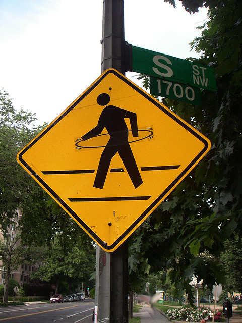
And is this sign on “S” street?
Now click here to Flickr to see what happened to the hula hoop person.
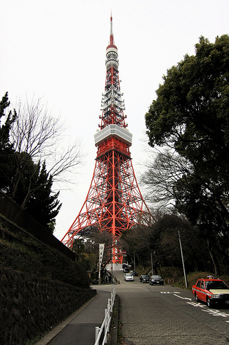
Comparison between Tokyo Tower and Eiffel Tower
This is Tokyo Tower located in Tokyo, Japan.
And below is Eiffel Tower in Paris, France…
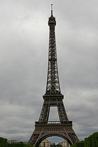
Notice how both of them are iron lattice tower and looks very similar.
They are essentially about the same height too. Although to be precise, Tokyo Tower has a total height of 333 meters (including lightening rod at the top) which is taller than the Eiffel Tower by only 9 meters. (Eiffel is 324 meters).
Eiffel Tower is much heavier at 7000 tons; whereas Tokyo Tower is only 4000 tons.
More about Tokoyo Tower
The Tokyo Tower has two observation decks: (1) the two story main observatory at the height of 150 meters, (2) and the special observatory at the height of 250 meters.
You can see views and video of what it looks like from the main observation deck via the Flash application at the Tokyo Tower’s main website.
More about Eiffel Tower
The Eiffel Tower is the most visited paid monument in the world. It was designed by Gustave Eiffel and completed in 1930 which was the tallest man-made structure in the world at the time of completion. But obviously by today standards, there are many other buildings that have been constructed taller. Tokyo Tower was built later at 1958 an was probably inspired by Eiffel Tower.
Its has three levels for visitors with a restaurants on them. No wonder it is heavier than Tokyo Tower which has no restaurants in its lattice structures. Although Tokyo Tower has a four-story building at its base known as FootTown which contain restaurant and shops.
References:
Sign to Rica Hell Hotel
This picture by Aleksander Dragnes on Flickr was taken in Trondheim Vaernes Airport in Norway.
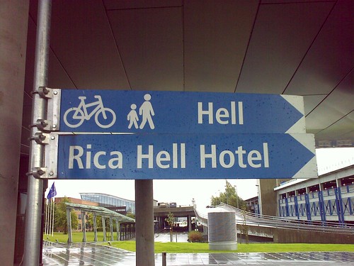
In English, the name of the hotel is not too complimentary. However, maybe it sounds better in Norwegian.
Actually, on Rica Hotels website, it says “Rica Hell Hotel is one of Norway’s largest course and conference hotels, offering an ideal venue for business travellers, for those looking for somewhere to stay before going off on holiday…”
Symbol for Post Office in Japan
That symbol with the two red horizontal lines and a vertical line below it is the symbol for a post office in Japan. This photo was taken in the port city of Otura, on the north island Hokkaido of Japan. Otura happens to be a famous tourist destination in Japan. So this is where you can mail your postcards.
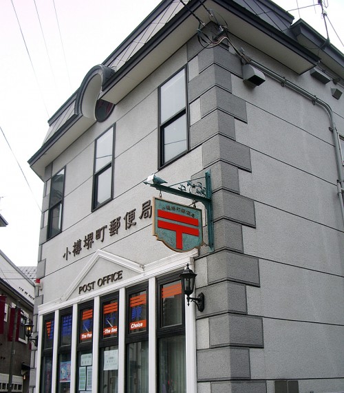
This photo happens to be taken in Otura, Japan.
